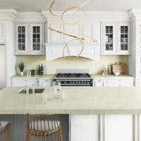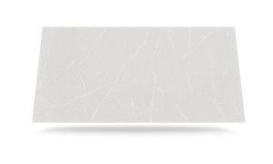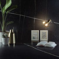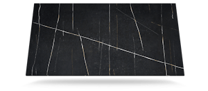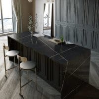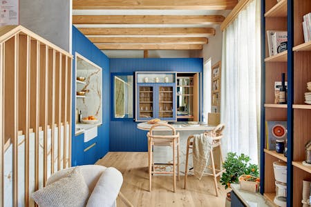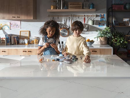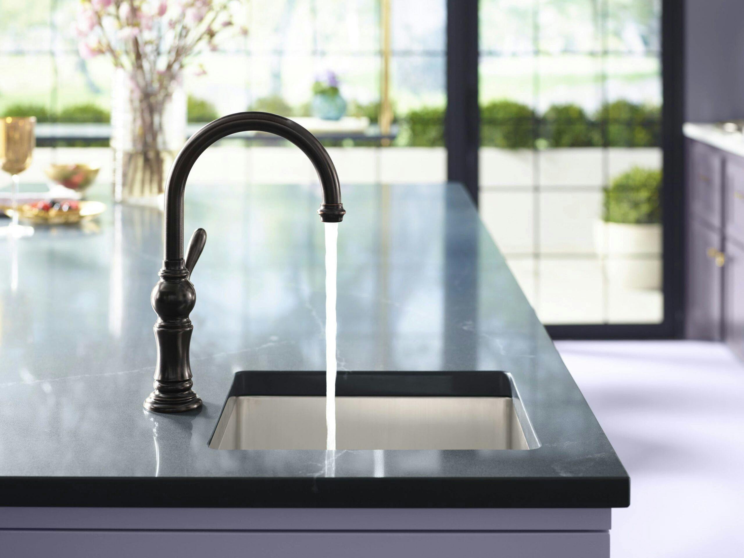
Denise McGaha, in collaboration with Cosentino, Kohler and Benjamin Moore, brings lilac to life in an incredibly functional and stylish kitchen layered in different tones of purple. The space is designed to be the true heart of the home; breakfast at the coffee bar and barstool area, a work station or venue to host lunches, and a perfect spot to enjoy an evening glass of wine before or after dinner. Denise used Silestone Merope on the bar and island and new Silestone Eternal Series Calacatta Gold on the counters around the cabinet walls.
Denise McGaha awnsered several questions about the look and fashion of her Lillac Kitchen design.
Interview
Who did you have in mind when you designed this space and how do you imagine them using it?
I imagined a family of 5 with children and parents and a few dogs - much like my family. They would use this space at all times of the day - breakfast (coffee bar and barstool area), during the day (mom or dad could work at the table or host lunches for friends and family) and evening (wine bar for before dinner drinks - access to patio area for outside hors d'oeuvres before dinner inside or vice-versa).
The design element that immediately stands out in your kitchen is the use of a color palette prominently featuring shades of purple. What about this color family spoke to you? How did you select and use these different colors without being overwhelming?
Layering multiple shades of plum and lavender and using Benjamin Moore's 2017 Color of the Year, Shadow, allowed this space to have drama and a palette that serves everyone. When using color, this palette makes everyone look beautiful in a way that doesn't feel either masculine or feminine. It's for everyone. Staying within the same color family keeps the color from feeling overwhelming. Also it works perfectly with the greenery outdoors to keep it from feeling too formal or stuffy.

