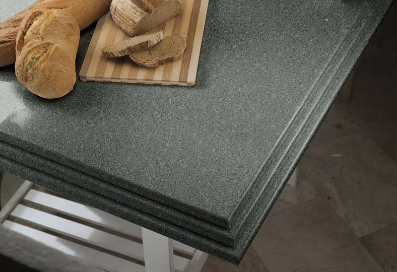
Green kitchen worktops
Increasingly, nature is becoming part of home interior design, with flora and fauna used as decoration and to clean the air Green is the colour of nature and works perfectly with interior design due to its fresh and calm tones, it can be applied all sorts of features in the kitchen e.g walls, floors, units and, of course, the work surface.
A green kitchen worktop can look very stylish, especially as many worktops these days offer sophisticated, elegant, dark and deep tones. Green colours with a strong hint of black are perfect for kitchen worktops, as they add a touch of class to the character.
WHY CHOOSE A GREEN WORKTOP?
It is a fashionable colour that you will never tire of, because a green kitchen worktop provides calm and tranquility and its appearance is timeless, in keeping with any decorative style that you may select.
A SYMBOL OF LUXURY
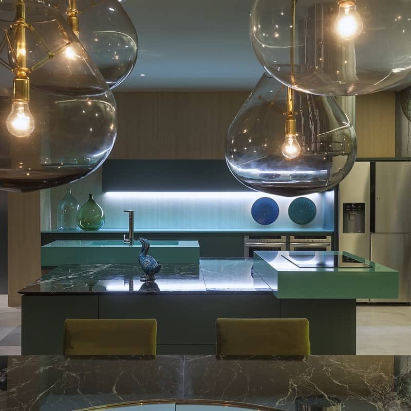
Did you know why green is the colour of hope? Green is seen as the colour of hope because it represents harmony, luxury and freshness You can make your kitchen look even better with a green kitchen worktop, as well as with a vertical garden or an urban mini-garden.
CREATING A SENSE OF DEPTH
Dark green kitchen worktops are on-trend, as they are colourful but with a touch of sobriety. Light, contrasting shades must be used in order to achieve depth. This is a very useful tip to visually enlarge the space.
WHAT COLOURS DO I MIX IT WITH?
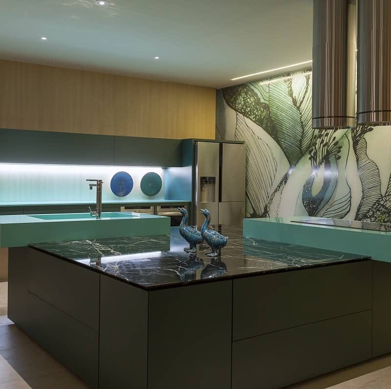
Green is the result of mixing blue and yellow, so combining it with one of these two colours is a very good choice. Also with wood and white or another light neutral tone, such as beige or soft grey. A few dare to combine it with red, as it creates a striking contrast.
TOO MUCH DARK GREEN IS NOT A GOOD THING
Cold colour ranges tend to enlarge spaces, but in the case of the green kitchen worktops, they are dark and can catch the light, so try to avoid the darker tones if you want a bright kitchen .
5 examples of green kitchen worktops
SOPHISTICATION ON THE WORKTOP
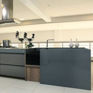
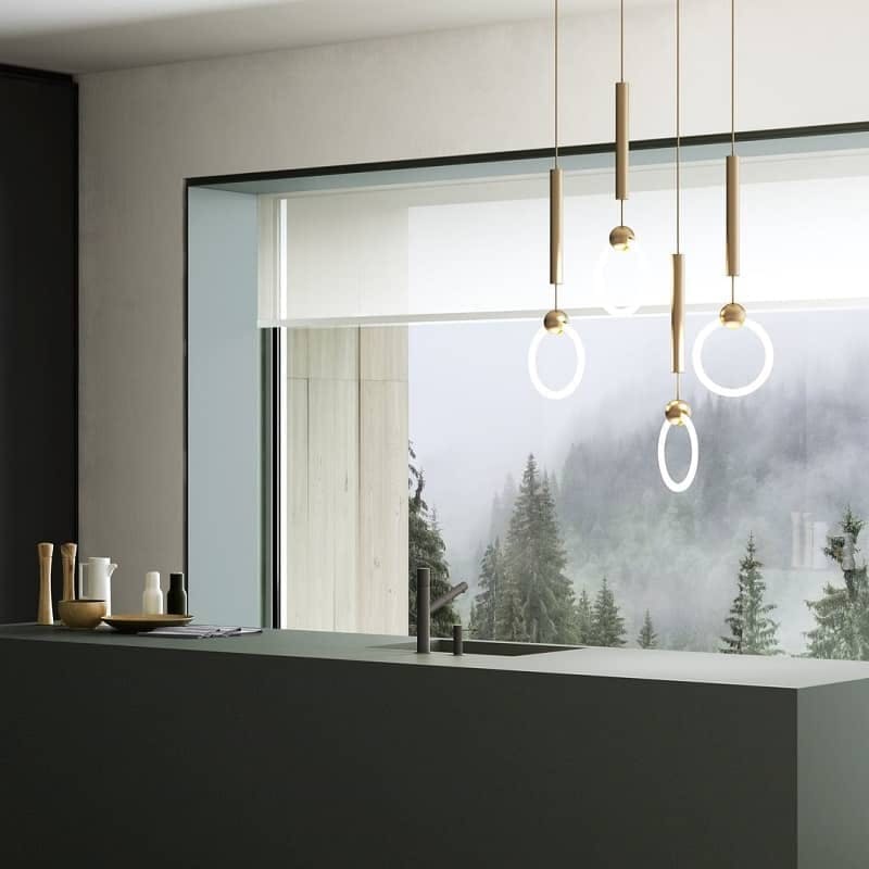
Launched in 2020, Feroe in ultra-compact DKTN material, features a sophisticated and sober dark green, ideal for green kitchen worktops with a refined look. It is available in a matte texture and can be used for all kinds of kitchen styles, from the most traditional to the most avant-garde ones. In addition to Baltic, a beautiful dark blue, Feroe is part of the Chromica series, which is the result of the company’s collaboration with architect and designer Daniel Germani.
MAIN DESIGN FEATURE
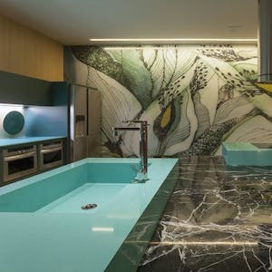
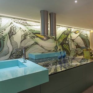
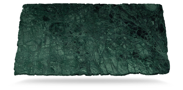
Between the bottle green and cobalt colour you can find Scalea’s stone in Verde Guaco, whose colourful and attractive look will become the main design feature of the space, providing a refined and fresh image. This option is so versatile that it is perfect for decorations with a touch of the tropics, but also for modern, Nordic and, of course, traditional ones.
STRONG DECORATIVE EFFECT
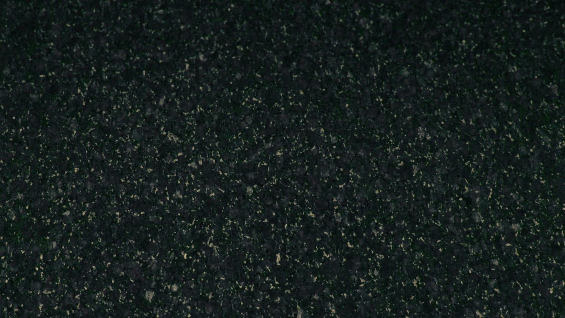
With such a dark green that almost appears black, like Verde Ubatuba or Verde Butterfly Oscuro both in Scalea, you will get a very enigmatic touch of art and drama. The fine-grained stone looks attractive and different depending on the quality of light . Due to their dramatic effect, they are worktops that must be combined with neutral colours for the other features.
AN ORIGINAL AND REFINED DESIGN
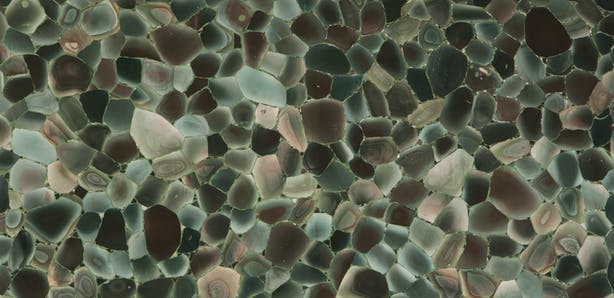
Finally, Prexury is a beautiful mix of semiprecious stones in different colours. Specifically, the brand’s proposal for a green kitchen worktop is Angel Jasper a combination from the softest aquamarine colours to the deepest green and emerald ones. A luxurious and unique material that provides a refined image.
TEXTURED OR SMOOTH FINISH
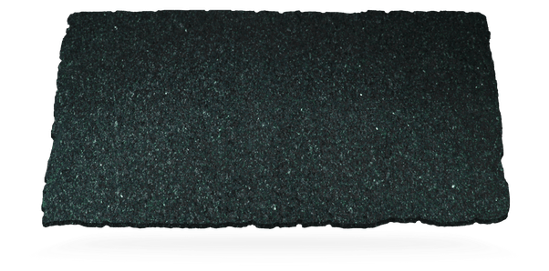
The designs in Scalea’s natural stone are unique due to their textures, grain, or veins in the same colour. Also Prexury’s semiprecious stone mix, has a stunning and charming range of shades. But if you are looking for a smooth finish, you should go for DKTN’s Feroe, a green kitchen worktop ideal for more moderate designs.

